The topic of maps, menus, and HUDs is often overlooked. They work best when you don’t have to think about them and we only really notice them if something doesn’t work. They’re everything but officially invisible. Like the Kuroko in Japanese theater. They’re apparent to the audience but we ignore them. No game reviewer talks about innovations in the menus or engaging maps. It’s all about gameplay, story, and sound, not about the support tools. But gamers are dependent on these tools.

In average games they serve a unitary purpose: Nothing more than easing the player along while they enjoy the game. But with horror games they do more than provaying information and continuing themes. They are a part of the fundamental gameplay and subtlety draw out the tension. Normal action adventure games, like Zelda: Ocarina of Time, the HUD clearly displays what every button does, and life and energy levels, while the menus show slots for every item, and the maps are straight forward linear affairs with hot spots clearly marked. The designers wanted the player to have an easy fun time diving right into the game. As such, the information is straight forward, easily presented, and no frills. But horror games twist their layouts and mislead their players. Fun is on the menu but the main dish is fear and the designers would rather not let the player get comfortable right from the start.
The
themes of survival are carried over to the support tools in these games. The level design, instead of being linear, is
winding, tangled, complicated by design.
This is naturally reflected in the maps.
In Resident Evil the map is laid out like standard blue prints. This is true for many map designs; they want
to convey a feeling of seriousness to gain the trust of the player. The rooms are clustered together with no clue
on the map as to which door is locked with what key. This enforces exploration with no clear goals
for the player to aim for. Exploration
is the only goal for the player at first.
Boss rooms, weapons, and key items are not highlighted. You start looking for keys to unlock doors to
look for some other little tid-bit to help you survive.

The map doesn’t tip the player on
which way to go or what’s in the rooms.
When the player enters a room their position isn’t revealed on the map
but instead the room will flash. The map
does allow a kindness to the player, if there are still items in the room it
will be colored red, otherwise the room is colored green. But there is nothing to indicate if the room
still contains key items or just an ink ribbon.
Silent Hill uses the standard blue
print design to help enforce realism, unlike the twisted Spencer Mansion; these
are designed to look like real buildings.
This is to heighten the uncanny effect of the town of Silent Hill. But despite its normal visage its level
design is just as twisted as in Resident Evil.
With its jammed doors, blocked passages, and roads that have dropped off
the face of the Earth, the normal map quickly transforms into a complicated
series of passages.

A quick aside: One of the big things that sells the concept of a horror game is the setting. If the setting and level design is realistic I can buy into the fantasy easier and suspend my disbelief. Silent Hill is especially good at this because most of the Fog town Silent Hill is a spot on derelict town; roads and sidewalks at proper length, apartments with closets and bathrooms. That is one of the things that pull me out of Resident Evil; there aren’t enough bathrooms or bedrooms for all those zombies. A proper setting can be hard to create; you have to get all the big strokes down, like a livable home, and then all the fine details, this can go all over the place from toys in the kid’s room to the type of outlets used. These little things stand out and help the player accept that this is a real place. The contrast of monsters, gore, and decay really punch up the emotions. If the player accepts that the location could be real, it’s the same as believing it is real, so it’s a small mental jump to say monsters are real also.
But back to Silent Hill, James, and
the other lead characters, will take notes on the map marking where passages
are blocked or open. He will also mark
interesting points he finds along the way, whether a suspicious grandfather
clock or save paints. Here the realism
of the map and level design plays in the designer’s favor. An apartment complex or mall can be a very
big place for the player to go through checking every nook and creny. But the dilapidation twists the layout making
a large portion of rooms inaccessible.
This works as an advantage to the narrative as well, it implies that the
rooms you can access allowed you to open them, that there are clues in the
rooms about your quest and about yourself.
Silent Hill is famous for its psychological bent. The Other World sections of the game only
further twist the layout. Previous notes
made on the map have been erased and the new layout may ignore doors, walls,
whatever the proper layout was. Spacious
rooms are now narrow with makeshift rust stained walls. The new notes on the map become the true map
for these sections.
I should also note there are a handful of sections without a map, like the building that’s under construction in Silent Hill 3, or the hand drawn map made by a child found in the church in the same game. The no map sections work well when the player is on the run. There’s something chasing them and they have no idea where to go. Also to ratchet up tension; without a map you don’t know how many rooms you have or haven’t searched as the layout is usually very big, and overlooking just one health drink can be costly. The child drawn map is unique as the layout is extremely wrong at first and as you go through you add notes. The layout becomes extremely chaotic at this point, as it is near the end of the game. Shape and size of the rooms are nothing like in the rest of the game this creates an erratic tempo. There is a rhythm to level design. Your character can only move at a set speed so the length of time in a room sets the tempo.

The map design in Fatal Frame functions like a compromise between Resident Evil and Silent Hill. It’s a fairly straight forward mansion but some doors are held shut by ominous forces. As the nights progress different doors unlock or become locked, creating new paths. This will correspond with the art design in game. The mansion starts off extremely decrepit but rooms look more lived in as the night’s progress. The recursive level design of horror games causes confusion in the player. The map will show which doors the player can and can’t use and every night the map is whipped clean. One thing that is fairly unique to Fatal Frame is that you can be attacked by ghosts in the save room, most other games use these as a safe area for your character. Playing against expectations is highly effective. With changing level design and misleading maps the player is confused and forced to use critical thinking which encourages survival.

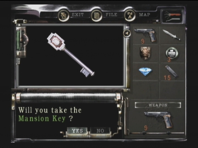
The menus in horror games act as a main hub for gameplay and as a place for reprise for the player. During stressful times of gameplay you can always pull up the menu and collect your thoughts. Although some games use real time menu systems. Resident Evil has three options for what you can do with your items; Examine, Use, or Combine. Examining items gives clues to the story and hints on game play. Use will either equip your item or just use it if it’s a healing herb. And combine is useful for item puzzles. Several of the items in Resident Evil are puzzles that can only be accessed through the menu. Survival horror games tend to be heavily puzzle based. And by having items act as puzzles it brings the central game play elements right to effect the outcome of the game, Silent Hill 2 increases the chances of the suicide ending if you examine the knife and the letter from Mary too much. Silent Hill 3 needs you to use Heather’s locket to beat the boss at the end of the game, and the locket is an item you start with.

Resident Evil use limited inventory as a sort of puzzle. Limited inventory puzzles are an old adventure game trick, like The Uninvited. A problem designers would find players would pick up every item and spam them on everything else to force the solution. So, with limited inventory, and excessive items to choose from the player can’t so easily spam force the answer. Here it serves a similar purpose but instead if just limited the amount of key items you can hold, it puts them in direct competition with your weapons, ammo, and health. This is nice as it forces the player to choose between protecting themselves with their safety items or moving the game forward with key items. Forcing the player to make difficult choices is a big fear inducer in horror games.

Fatal Frame uses another system that isn’t too unfamiliar to horror games; RPG elements. In Fatal Frame you only have the one weapon, the camera. And in order to have the player stare down the ghosts the longest they assigned a points and reward system. If you time your shots perfectly you can land a zero shot or a fatal frame shot, but these are the hardest to pull off and highest risk of being hit. This really makes for a nerve wrecking points system. But of course the stick works best with the carrot so rewarding the player by allowing them to spend their points on upgrading their camera. Basic upgrades like increasing power, speed, size of capture circle and special ones like a super shot, freeze shot, slow shot, or turn visible shot. It’s a mechanic that works well with the gameplay and story.


The menu is also where files and life levels are shown. Having the files in one location is convenient especially when they contain clues for puzzles, but they mainly serve to flesh out story, and occasionally explain game mechanics. But the health displays unlike more common action adventure will be presented veagly. In Resident Evil life is represented with simple labels “fine,” “medium,” “danger” and corresponding colors. One troubling label is “poisoned” when poisoned you do not get to see your health level while it slowly drains; the only clue to your health level is your body posture. Silent Hill keeps a screen shot of the paused game and it becomes red and staticy the worse your condition is. Fatal Frame uses an easy to read life bar. But it’s slightly more complicated than that, the enemies deal damage that varies greatly. This vagueness of life levels keep the player in suspense.

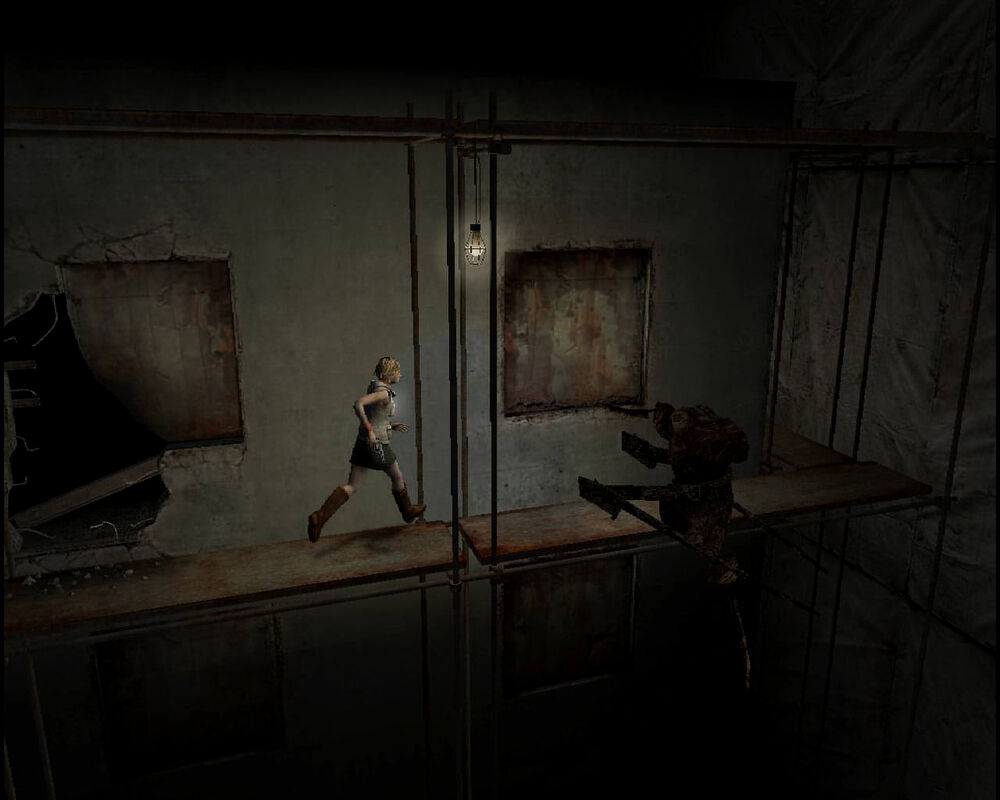
The life levels displayed in the menus is one of the main differences in horror games. Normal action adventure games would have that displayed on the HUDs. Normal HUDs display all the useful information a player would want to have; life, ammo, energy, etc. But most horror games have the HUD completely free of any thing. This makes the experience more cinematic and immerse. Some screens may flash red when hit or bits of blood or dirt may get flecked on the screen but they try not to stand out. They instead imply health levels with the posture of the character. The more damage they take the more they limp and the slower they move. And since the characters already move slowly it can be quite debilitating to be critically hurt. Naturally this helps encourages players to avoid the enemies. This is the most effective design for the HUD, without any clue about your stats it keeps the player sharp, counting their shots and approaching enemies with caution.

As more horror games become more action oriented HUDs have been resurfacing. Dead Space has a very ingenious design for its HUD; the life bar is imbedded in Isaac’s spine, ammo displayed on the gun, and the menu is projected in front of him and we as the player are only looking over his shoulder. First Person Shooters still need a HUD as they can’t show the character’s body posture. Fatal Frame uses both first and third person perspective. In regular mode going around the mansion you are in 3rd person mode and in combat, when you raise your camera, you switch to 1st person mode. This is very effective as the player is more empathetic from seeing the character in 3rd person. Seeing the small vulnerable girl up against the big scary shots. And then forced to combat, the camera changes and now the danger is in your face. With the mechanic based around a camera it is very natural to switch between 1st and 3rd person. Personally, it’s the only game I know that can do it without breaking immersion.
Something to keep in mind is the
point of a horror game is to scare the player.
Most games simply strive to be entertaining but horror games are trying
to create atmosphere. Everything needs to
contribute to create atmosphere, and this is where the subtle brilliance of the
support tools shines. These are the
parts that work best.

The map acting as a puzzle. The player will depend on the map to find the shortest and safest route. This puts the player in the mindset for survival. The misleading maps, like in Silent Hill, encourage exploration and put the player in an apprehensive mood. When your only clue on where to go can’t be trusted you tend to step lightly. This is extremely effective in setting the mood for the player. Changing the original layout of the map to make a twisted one, makes the player second guess their movements. This distrust in the map is vital for creating suspense.
In menus examining items encourages and enforces exploration. By having items hidden in other items, like a key inside a book, and other items that are puzzles that can only be accessed through the menu, encourages players to examine all items for clues. Examining your gun and first aid spray in Resident Evil reveals that both are made by the mysterious Umbrella Corp. Hinting at the range of businesses they’re involved in.

Keeping the HUD clear from clutter makes the game play cinematic. Without life and ammo levels displayed players are free from distractions and can be further engrossed in the game. By not showing these it helps draw out tension. On average, an enemy can kill a character in two or three hits. Most of the games will have the enemies deal out various amounts of damage, light and heavy attacks, this adds to the stress of not seeing your health level. Did the giant spider just poison me or just wound me?
One thing I’m surprised to find
only used in one game is a screen saver.
In Fatal Frame if you let the game sit for a few moments the screen will
begin to be covered with bloody hand prints.
This is especially effective as the game doesn’t feature much blood or
gore. Save items, like the ink ribbon,
work very well making your character’s mortality into a commodity. The Fatal Frame games all offer an infinite
amount of the weakest film for your camera, as there are randomly generated
enemies. But the first game gives the
illusion that there’s a limited amount of film as you can only restock up to 30
shots from any save point. This is incredibly
effective in stressing out the player as they believe they are on the verge of
running out of ammo but it’s only a short distance from restocking.

But not all mechanics work. These are just some that either fail to work or breaks immersion. One problem that is frequent in all sorts of games is the map layout spoiling a boss encounter. Too often you’ll look at the map and find a large room with only one passage way that leads to it. Maybe even a save point before entering the large chamber. Anyone with any deductive reasoning can tell that there will be a boss fight. This can be used for making the player anxious if it’s coupled with other bits of foreshadowing. But too often a boss fight demands an arena against an over-sized behemoth. This really doesn’t have to be the case. There could be small bosses to in tight confiding areas. Or play with the expectations of the player. They’re use to having a boss fight in the massive last room in an area; the player will be dreading it the whole time. How about once they arrive they find it empty maybe, even the key item just sitting there, baffled, the player will make their way to use that key but find a small chamber along the way now has a large boss in it. As it chases you through the area it knocks down walls changing the layout of the level. It finally finds an area to settle in and have a proper fight or maybe the destruction it causes leads to its demise. Either way you now find yourself at the other end of the area, with a new level layout, maybe a few new enemies have been kicked up as well, all with the added burden of lugging around the key item.

One very annoying mechanic that pops up is real time inventory. The concept is sound, if you need to get something out of your inventory the time you spend is still in play. So if you need to get something while an enemy is in the room things can get hairy. In games with online play or multiplayer this is required to have any menus and keep the systems in sync. But they are extremely annoying. Single player games with no online content have no reason to use this mechanic. Left 4 Dead does deal with this very well; instead of pulling up a menu you only have four options on the D pad: A quick and simple button press, no mucking about with choosing options.

Another annoying mechanic that crops up is fetch quest overkill. Fetch quests aren’t bad in moderation, properly paced out over the game, but some games don’t understand pacing. Rule of Rose, for example will have you performing fetch quests at noisome for every non-combat section. They have it set up where you select an item and set it for your dog to track and you then follow the dog as he leads you to that item. What’s worse is the system is flawed on top of it. There are several special items that need specific bait to find but you practically need to be in the same room for the dog to find them. So you have to know in advance where the item is before you have your dog track it. Brilliant.
Another thing that pops up are
sanity meters. These are completely counterproductive
to trying to instill fear and creating a feeling of insanity. The concept makes sense and works in the dice
and graph paper games like Call of Cthulhu.
There you’re playing with a group and everyone needs to be clear on whose
how insane. But in the largely single
player world of horror games they just create an ineffectual mechanic. First; most games, like Amnesia and Call of
Cthulhu: Dark Corners, instead of showing any madness it just makes the screen
go blurry. What little this does, it at
least encourages the player to not look at the monsters. As keeping them mysterious is more effective
at frightening the player. At least it
would if there was more correlation with what drives down the sanity meter and
the effects. Too often the screen blurs
without any obvious trigger.
Unpredictable effects can add tension but this just comes off as
annoying. Having an easy to read meter
show your sanity level completely undermines the concept of going insane. Pre-scripted sequences of madness are far more
effective.

In Silent Hill 2, James goes through a demolished building but it stands as he remembers it, doors that don’t lead to where they should, and goes down an impossibly long stair case, just to name a few of the mind bending things. The game presents these fantastic elements with the same lack of fan fair as it presents the mundane. Scripted sequences are the most ideal way of dealing with insanity; it allows the designers to control the pacing. Eternal Darkness: Sanity’s Requiem is famous for its use of sanity meters. Instead of just blurring the screen it creates interesting effects. Camera angles changing, hearing enemies that aren’t there, seeing body parts fall off your character, and probably most famous the effects that break the 4th wall and messes directly with the player; saying it deleted your save files, having a fly on the TV screen, having the volume go way down. These effects are entertaining at first but become a joke with repetition. And the effects that break the 4th wall only further highlights that you are playing a game and break immersion. These types of Meta effects may have worked better where the game acknowledges that it’s a game, like Nameshi no Gamu (the No Name Game) ultimately when trying to scare the player a sanity meter doesn’t work. Randomly blurring screens are just annoyed and even cleverly designed effects only highlight that it’s all just a game.
In Silent Hill 2, James goes through a demolished building but it stands as he remembers it, doors that don’t lead to where they should, and goes down an impossibly long stair case, just to name a few of the mind bending things. The game presents these fantastic elements with the same lack of fan fair as it presents the mundane. Scripted sequences are the most ideal way of dealing with insanity; it allows the designers to control the pacing. Eternal Darkness: Sanity’s Requiem is famous for its use of sanity meters. Instead of just blurring the screen it creates interesting effects. Camera angles changing, hearing enemies that aren’t there, seeing body parts fall off your character, and probably most famous the effects that break the 4th wall and messes directly with the player; saying it deleted your save files, having a fly on the TV screen, having the volume go way down. These effects are entertaining at first but become a joke with repetition. And the effects that break the 4th wall only further highlights that you are playing a game and break immersion. These types of Meta effects may have worked better where the game acknowledges that it’s a game, like Nameshi no Gamu (the No Name Game) ultimately when trying to scare the player a sanity meter doesn’t work. Randomly blurring screens are just annoyed and even cleverly designed effects only highlight that it’s all just a game.
But with the hinge sight of this
report we can extrapolate what can be built upon for the future. The use of screen savers has good potential. It’s very surprising that they are not used
as much. But the trick to their
effectiveness lies in handling it like a subtle jump scare. Fatal Frame deals with a lot of torture and
violence but it is not gory. This is why
the bloody hand print screen saver is so effective. The game has set up blood as a taboo, only
hinting at it in the game but when the screen saver kicks in it unabashedly
breaks that taboo. This is something
horror games need to embrace for the future.
Setting up a taboo, giving the player comfort in expecting that taboo to
be held up, and then break that taboo. It doesn’t need to be a screen saver,
but it does take discipline to up hold a self-imposed taboo, but the moment the
taboo breaks it really shocks the player.

When sanity meters use Meta gimmicks to frighten players it ultimately highlights that you’re just playing a game. But consider using Meta elements in something that already breaks the 4th wall… the menus. The menus already directly address you as the player to choose to equip, examine, or use your item. And through the repetition of checking your stats the menu becomes a safe haven for one to collect their thoughts. This creates a perfect opportunity to betray that tranquility and directly scare the player. This can be something subtle, like the background slowly changing or commands changing to personal attacks to the player: Changing “use” to “fail” or “examine” to “kill yourself.” One trick I believe would be highly effective is while examining an item, the item goes into a little display model animation, as the player watches the animation have something violent or horrible happens in the background. Make it too fast for the person to see properly and it will really freak them out. The description of old items mocking the player, possibly pointing out rates of failure. Or have the changes be bold with shocking jump out scares. Like introducing a new enemy that takes over the mind of the player and the menu is now where it manifests itself. Items changing into something morbid or perverse.

Maps that don’t correspond to the level design or change with the level implying space is warping. Every few rooms the map subtly changes leading you further into a maddening maze. The important thing to keep in mind is stress versus annoyance. Messing with the player should induce stress not annoy. It can be a fine line between the two. The only real way to find out is through play testing.

In closing maps, menus, and HUDs help to heighten the tension in the game through misinformation, withholding information, and controlling information. The maps dispense misinformation, HUDs withhold information, and the menus control information. The themes of horror game all branch out from survival. The support tools demand from the player a level of critical thinking that most games lack. Everything is difficult for the character. You have to rely on your wits if you want them to survive.